Sunday, 22 May 2011

Just my type.

I have been thinking about typography, I've always had a bit of a fascination with it. When I was about 10 my Mum bought me this book from the school book club. I spent hours tracing and duplicating letters and marvelling over how the word frozen appeared to melt etc. - I adored this book...


(...and so did a lot of other people, judging by the statement on the front cover.)

I guess the appeal of a book like this is far less now computers are in abundance; nothing like seeing print on pages though! I admit, I was quite blown away with Nicky's kindle last week, but I like fonts on pages and I guess that's pretty fortunate, (being a reading teacher!)

But I like nice typography everywhere, in Artwork, on my food packaging, on buildings - it pleases me enormously when word(s) are presented in an unusual or interesting or even just an appropriate way.

So I thought I'd write about some recent purchases and creations. I'll start with the purchases...
Using the wartime propaganda font and layout from "Keep Calm and Carry On" and the "What Would ****** Do?" slogan, the people at "Not On The High Street" came up with this poster that I have bought and framed for my kitchen wall. I was slightly sore at Jamie when he intervened with Education and it's "failings" but the more his "Dream School" series went on the more I think he appreciated how difficult the task can be. You're forgiven Jamie, and you can still be an inspiration for my cooking... (I'm sure you were petrified for a minute there....!)


I love that idea to replace the crown with a chef's hat!


You can buy a copy (in a choice of 3 colours) here:-


You can also buy "What Would Delia Do?" that does, admittedly, roll off the tongue a bit better, but she lost me a bit when she started cooking with tins of mince last year. (You're only as good as your last book!)

And IKEA have a great new range of "odby", rounded edge frames that set it off well I thought.


Then I spotted this in M&S and I had to get one...


Marks and Spencers typography is so well done sometimes. like in this tetra pack of milk bottle sweets...
so cute!


The above is a picture borrowed from "Bowie Style's" post on typography, where she has included more examples from the sweet department at Marks. If you're interested...

http://printpattern.blogspot.com/2010/01/typography-marks-spencer.html

I have also completed another long overdue project. I stumbled on the work of Craig Damrauer a while back and I think it's fab! He's called it "New Math" and it's basically simple equations that define words.

This has been framed for my bathroom:-


He's just got it so right with these designs. The font is clean and simple, (something like Arial narrow??) and Maths IS blue for me, I don't know why it just is. In the same way that cheese and onion crisps should be GREEN and Salt and Vinegar BLUE. I don't know why Walkers do it..., Golden Wonder had it right!
Other New Math designs I really like are:-


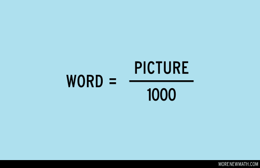


He's got loads on his website, obviously, once the template was there, further work was easy ;) 
Some are really clever and appropriate for loads of occasions I reckon. You can buy his stuff on posters or t-shirts, obviously I didn't save the Jpeg and print it onto good quality paper as that would be stealing his ideas... 


And that leads me onto another bit of typography that I love. On the wall of kitchen in Harriet and Rhi's rented house is a poster and when we popped round for a coffee when they moved in Rhi said it was the poster that tempted her to take the place. It looked like the slogan had been hand printed onto paper but after a bit of googling I found the origin...


The poster formed part of an exhibition of Art on the London Underground (Glousester Road Satation). I've looked all over the Internet to try and find it as a poster but it doesn't exist so the largest I can print it with any quality left in the design is postcard sized. I found some nice little frames in IKEA to set it off quite well though....


The Art initiative on the underground is called "Platform for Art" and there is a book about it (on the designated website) that I might just have to buy...
http://art.tfl.gov.uk/

At work this week I was looking at all the good use of typography on the children's books I teach with and I thought about mentioning some of them but I think I'll save it for another day... I've got too much to say about children's books and they deserve a separate posting when I've got more time...
So finally, a couple of weeks back was Bella's (Annabel's) birthday. And it's been a while since I made some personalised paper so I got busy and made a few sheets. Quite nice for a bit of interesting (and thrifty;) personalisation....


The wrapping paper I settled on was the one I made with "Times New Roman" printed in various greys. And that was the reason I chose to finish it with pastel gift tie.


Another option was "Ariel" font with some bright parcel tie, but I didn't like that option as much.


And I also dis guarded the black print option with bold parcel tie colours. I did do this one Christmas however, and the black writing against gold and red parcel tie looked amazing!
It is also worth noting that the black enlarges better than grey on a photocopier if you wanted to wrap bigger presents and that it is good to wrap your gifts in tissue paper first if you're using rubbishy see-through paper on a works photocopier. I'm sure like me, you would never be unprofessional and do personal photocopying in work, however.... ;) This would also be nice if you printed the paper with the same sized name, used all different fonts for their name and chose a "kiddy" font such as comic sans if the present was for a child!

Okay, well, this blog post, plus making banana and walnut loaf cakes have helped me procrastinate for quite some time today, but I'd better get on with the work I am doing for my M.A in dyslexia teaching. To make the resources for my students in the most "reader-friendly" way I also bought an expensive font...

it's clever though, take a look...

http://www.clubtype.co.uk/index.html

(it writes in separate or cursive style, draws a grey outline for tracing over, puts "guidelines" above and/or below the writing and puts flicks on the letters for the first stage of learning how to do cursive (joined-up) handwriting.)

I also had a look at this one, but felt it was "over scaffolding"... ""Over scaffolding" seriously, there are some really poncy words banded about in Education...

http://www.readregular.com/english/regular.html

Food for thought though, I'm learning an awful lot about how the brain learns to read on this course, (whilst frying my own a bit).

J :)


Thursday, 28 April 2011

Wedding Fever

I'm flippin' loving the fuss, fact! However, I seem to have had too many good offers of events this weekend and I've picked the one that doesn't involve watching the event - hope I don't live to regret this.... Am Devonshire bound for a walk with Thomo and co. and will have to watch it on iplayer afterwards.
As a thank you to Fiona for her kind invite of "High Tea" at hers and as a bit of a sorry for dithering over my plans I decided to get a little something for her:-

Comedy Coaster (from one of Clifton Village's finest posh tat shops....)


Then I thought I'd wrap it... but I had no nice wrapping paper. So I quickly designed some on my computer:-


I google imaged "keep calm crown" and the only image without writing attached (I can't use photoshop) was a pink one. Quite nice anyway as the coaster is purple and it's for a girl after all...

Then I pasted it into my brilliant "Corel Printhouse Magic" programme, which unfortunately they don't make any more. Sarah and I love this programme and when I took my precious cds (that I paid well over the odds for on eBay) to install on her computer last Christmas my sister was so evidently frightened by our nerdiness of versions, specs and compatabilities she almost had to leave.

Anyway, I made 3 different sized crowns, arranged a bunch of them, re-grouped them and duplicated them until I was happy with them arranged on the page then printed the design onto cream paper.

This was the first attempt. (They were too bunched up.)


2nd attempt ...perfect!


A crown I didn't use was cut out and attached to one of the million Christmas gift tags I find myself left with:


And here it is:-


And some other totally cool things that I have been spotting:-

Pieminister (savoury pie) - Sainsburys:


Pieminister (Sweet pie) - Waitrose:

Yum!

And last but not least, Vicky's Mum has HAND KNITTED this brilliant collection of the Royal family... Vicky has been having text updates such as "Just finished Kate's torso....." for weeks. What a labour of love, with teeny tiaras and medals and sequins and gold threads and pearl beads and loads more - just brilliant!

Here's Liz:


Harry:


A sneak preview of the dress:


The happy couple together:


Ahhh whoops, I've managed to make it look like Wills is trying to chop her head off...

Take 2 (by a plant) :-


And not forgetting a corgi for good measure:


Great work Vicky's Mum; you are an uber talented knitter and your attention to detail is incredible.
They're all from this book... How many people must've bought this and not opened the cover...? 
It's sold thousands...
http://www.dailymail.co.uk/news/article-1365155/Royal-wedding-How-knit-Kate-Middleton-Prince-William-corgis.html


I met that Archbishop, (the living breathing Rowan Williams one, not the knitted one). He came to the school I did teaching practise at and wished me well for my teaching stint in New York.
He seemed like a nice man. Do you remember Gaby?

What I am looking forward to the most however, is seeing what cake they chose...

Enjoy the fun!

J :)


Monday, 25 April 2011

Do-It-Yourself Easter Cookies

Another example of Bakerella's brilliant work was her "Cowgirl Cookies". The woman is a slave to detail, ....Rrrrrrrrrrrrrrrrrespect!) Basically, what you do is fill an appropriately sized glass jar in careful stages so that all the ingredients of delicious chewy cookies are on show (a bit kind of like the sand in the bottle trick). You could give them a "theme" for any time of year, Easter seemed perfect, so I started filling jars of D-I-Y cookies in layers, like so:-


Here's the contents of the jar:-

1 1/3 cup all purpose flour, spooned into measuring cup & leveled
1 teaspoon baking powder
1 teaspoon baking soda
1/4 teaspoon salt
1 cup cooking oats
3/4 cup m&ms
3/4 cup semi-sweet chocolate chips
1/2 cup brown sugar, packed
1/2 cup white sugar
1/3 – 1/2 cup chopped pecans

..................................................................................................

And here is the "filling order":-


First: flour, baking powder, baking soda and salt
Second: oats
Third: m&ms
Fourth: chocolate chips
Fifth: brown sugar
Sixth: white sugar
Seventh: chopped pecans

..................................................................................................

And to make up their delicious cookies, the recipient will need to:-

Add:
1 slightly beaten egg
1/2 cup butter (118g) (melted slightly in the microwave) 1 teaspoon vanilla


And....

1. Mix wet ingredients into dry ingredients. Use the back of a large spoon to work it all together.
(Use hands to incorporate everything if necessary)

2. Then roll the cookie dough into 1 1/2 inch balls, place on a parchment covered baking sheet and bake for about 10 minutes in a preheated 350 degree oven.

Makes about 26-28 cookies.


I've eaten some round Priya's and they were superb!

Above is as it is on the Bakerella website, some extra points to note:-

I converted a "quart" jar into litres and it was about 1.1 litres
I could only find a 1 litre jar from Asda (£1 each - bargainous!) and there was more than enough room.
I chopped up one large bag of pecans between the 3 jars (150g)
I used 2 large bags of M and Ms between the 3 jars (185g). This was a little under her measurements but I didn't want to crack open a 3rd bag and have them hanging around the house. I love M and Ms, I'm firmly in that Camp not the Smarties one - yeuch!
I used one pack of silverspoon choc chips per jar. (100g)
I think if you were to give them as a kids present milk choc might be better, I used dark but Tom will eat anything to be fair.
Spoon the ingredients in slowly pushing out to the edges first - flour will muck it up otherwise.
A rubber spatula was the best tool for the job here.
I also tried to keep the baking agents away from each other so they didn't start "reacting" so quickly in the jar.
And that's about it...

Here are the filled jars:-


But better than that, here they are with "Easter embellishments"...


And as you can see I made little tags that have a list of what you need to add to the mix and instructions on how to cook the cookies. I always find that the neatest writing you can do by hand is the font that Liz W taught me... you get a permanent black marker (it's darker), write the letters neatly with small balls on the end of each stick, then outline with a gold or silver metallic pen.


Easter chicks were 14 for £1 from Poundland. I looked in Paperchase first but they were £3 for 6!!! I have to say, the Paperchase ones did look a little more "free range" - a few of my Poundland boys had 1 eye, but I only needed a few... it was survival of the fittest :( Ribbons and nests were also cheap from "The Works".


The toppers were stuck down with a Glue Tape roller machine - so much less fiddly than glue.


Check out the original recipe as she presents hers with fabric tops and labels. I suspect you could get these jars in Hobbycraft but they'd be pricey... She also shows you how they should look prior to going in the oven and how they look cooked.

http://www.bakerella.com/mix-things-up/

You can freeze the mixed up uncooked dough for portion control and to test oven timings in smaller batches too.

Eat, enjoy and know that they are on sale in Bristol's poshest deli for £11.50 in a smaller jar. Rip off!
I took a sneaky photo when I lunched there on Monday... Ommmnnnnnn!


Much better to "Do It Yourself". Go on....

J :)

Friday, 22 April 2011

Mars Bar Cornflake Cakes (Easter Style-eeeee!)

As a thank you for tending to my unruly garden today I made my parents some Easter treats in the form of "Easter Mars Bar Cornflake Cakes" At one point I did stop and question whether they were a bit "kiddy" for my Mum and Dad, but then I thought, you know what, they've eaten fish fingers, alphabites and baked beans every Monday night for about 20 years...! I concluded they wouldn't mind, they didn't, they loved them. "Scrumptious!" said my Dad, reaching for a 3rd one...
So, anyway, they were easy (very easy) and very, very tasty.


To make these you will need:

50g unsalted butter, at room temperature
2 tablespoons of golden syrup
260g Mars bars, chopped into 1cm pieces
150g cornflakes

What you do:

Line a 12 hole muffin tin with paper liners (my mixture made 15)
Melt the butter and golden syrup over a very low heat, stirring constantly.
Add the chopped mars bar until just melted.
Remove from the heat and gently fold in the cornflakes.
Refrigerate the cakes

...............

To top (you will need):

90g good quality dark chocolate (70% cocoa solids)
110g unsalted butter, at room temperature
1/2 tablespoon of semi-skimmed milk
1/2 teaspoon of good quality vanilla extract
125g of icing sugar (sifted)

What you do:

Melt the chocolate in a bowl over simmering water (don't let the bowl hit the water).
Meanwhile use an electric whisk to mix the butter, icing sugar, vanilla and milk in a large bowl.
Add the melted chocolate to the large bowl and mix until it forms a smooth, thick frosting.

...............


Top the refrigerated cakes with the frosting and plonk some mini eggs on top. As usual I couldn't resist the edible glitter....


The recipe comes from "Cupcakes from the Primrose Bakery" by Martha Swift.

It's actually the first recipe I've made from this book but I was sold on the Nigella endorsement on the cover, the nice cake presentation ideas and I also liked the way it was organised into a calendar year with seasonal recipes. It's a good format and "The Hummingbird Bakery" clearly thought so to make their new book read in the same way...


At some point I'll make the pilgrimage to London to eat at both of these Cupcake establishments,


but in the meantime I'll keep baking the cakes and deciding which ones to try when I get there...

Happy Easter!

J :)


Thursday, 21 April 2011

10 reasons why I love his work...

A couple of years ago, whilst browsing design websites, I stumbled on an amazing print maker (Graham Carter). He works out of a gallery in Brighton and when I saw some of his work I really wanted a print. And there was one in particular that I couldn't stop thinking about.
I found this particular picture, then I put it as my desktop wallpaper on my P.C so I could keep looking at it and deciding if I could afford to buy it...
Then I saw that "Boxbird" (his gallery with wife, Alice) were having a stall at "The "Affordable" Art Fair" in Brighton. I decided to go, and if the picture was there I'd buy it. So an incidental weekend to Brighton was planned.
I was half hoping the picture wouldn't be there as I felt excited about owning it but slightly sick at the price.
Amongst a pile of other cute pictures, it was there... and on the textured hand-made paper it looked even better than I'd imagined.
But I still thought I couldn't justify spending all that money on what is, after all, one piece of paper. So then I suggested going to think about it over lunch and dither some more. But then Patrick said to me... "Okay, if you can list 3 good reasons why you think it's so great I think you should get it!" I quickly gave him 10 and passed over my credit card within five minutes.
And I'm so glad I did; it makes me smile every day, and I looked at it gleaming in the sun this morning and thought I'd write about it today...

"Quiet Carriage"


There is just no way I can do this justice with a photograph, especially with the glass making it so hard to photograph. You can see how the colours are more calming and less lurid than in the picture from his website (below), however.


And so, the ten reasons I love it:

1) The very clever limited palette. It's so '70s, with the oranges, blues, browns and creams.
2) The colour scheme being warm inside and cold outside giving it nice contrast and a cosy feel and atmosphere. I like the small touches of blue inside too just to balance it out.
3) The fact that the people are dwarfed by the enormous seats in a way that you remember from childhood, like when you start getting convinced that Mars bars were ginormous but actually you were probably just smaller.
4) The laptop and mobile phone suggesting a modern era in comparison to the colour scheme, I like the clash.
5) The pattern of the seat material being reminiscent of Old School British Rail and the snowflake pattern outside being repeated as an icon on the cup inside, it's nice in a kind of positive/negative way.
6) The massive coffee cup is so out of proportion but somehow it works, as does the smoke coming off the coffee that is both a part of the design inside and outside the train.
7) A wacky plant and birds are on the table!
8) The people look content (as am I when I get a table seat) - table seats on trains are great!
9) The little suitcase suggests a mini-break or adventure as does the little temple in the background and adds optimism and excitement.
10) The "squircular" borders make you feel like you're looking through a window at them as well as them having a window to look out of. Actually, I don't think the borders are "squircular", I think that's a square/circle hybrid - not sure if there is a word for rectangles with rounded edges, but I like those shapes...

I actually wonder if the artist liked it as much as me, he was a man of few words when I met him but sooooooo full of good ideas!
And what I find so weird is the fact I'd kind of started decorating my whole bedroom around this picture before I even knew it existed...

Lightshade: Ikea


Jewellery Trees: Ikea


"Urban" Chair: Ikea


Wallpaper: B&Q.


And a style consideration that Bella taught me... position mirrors to reflect interesting patterns from opposite or to reflect something of interest (light fitting etc.)
At certain angles it looks like a picture in a round frame...


Dressing table: Ikea


Orange cushion: Gift from Bella (bought from House of Fraser)


Velour Cushions: Woolworths (Ahhhh, Rest in Peace Woolworths!)


"Sputnick style" Clock: Home Sense


Photo frame: Asda


Despite the fact I have some nice pieces of Art that I've collected for downstairs of my house this picture is my favourite and it's a bit weird to ask visitors to come and look at Art in your bedroom (could get misconstrued for "etchings"...) so it doesn't always get seen which is a shame. Another reason for me to shout about it here... :)

This Summer I WILL finish my study... the starting point is my Isak tray that Nic gave me for Christmas last year but I won't say any more until I actually get around to finishing it... The wallpaper is up at least and I'll just keep looking at "Apartment Therapy" for ideas to perfect it...
http://www.apartmenttherapy.com/

Fortunately, this picture, "Red Nest" also by Graham Carter, is sold out or I'd be wanting this one... I could give you 10 reasons why I love this but one too, but I won't torture myself...


And just look at "Polkabrella"  with her little bottle of coke... all in sickly sweet colours, just brilliant!


J :)


P.S. If I haven't told you what I paid for "Quiet Carriage", don't ask me, and if I have told you, please never tell my Mum... ;)

P.P.S. Antony says that wallpaper is a waste of rainforests; I say if I use the remainder to wrap presents I am forgiven... :)

P.P.P.S. Look at these lovely cards by Ruth Green, that I just had to get for Bella, Priya (and myself).
There's so much nice stuff at Boxbird...!
http://www.boxbird.co.uk/shop/ruth-green/botanica-notecards

SOMA gallery in Clifton, Bristol sell some work by a couple of the Boxbird artists and by some other good ones too...
http://somagallery.co.uk/somashop/

P.P.P.P.S. If you are ever wondering where to dine out in Brighton, this place was one of the nicest I've ever been to...
http://gingermanrestaurant.com/menu/lunch

Yep, think that's it for now...!

No it's not.... great framing shop in Bristol:-
http://www.skyframing.co.uk/

Okay, that really is it!

J :)